 Everyone needs to know how to read graphs. Data is often presented graphically in textbooks, news reports and scientific journals, and the ability to correctly interpret the information is a crucial skill for scholars and citizens alike.
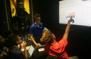
This was the motivation behind a recent unit that STEM Program Co-Leader Charlie Cohen completed with our after school students. Starting with data from basketball-reference.com, our young men learned how to construct a variety of graphs from datasets. (The students also learned a lot about some old-school NBA players.)
Using Google Sheets, our students input data and then used Google’s built-in graphing features to create a variety of graphs and charts. For example, they input career stats for Chris Mills, who played for the Cavaliers, Knicks and Warriors from 1993 to 2003. Using that data, they created graphs to illustrate his career shot average, 3-point percentages, and 2-point percentages (see below).
Working with data and graphs this way gave our students a deep understanding that will help them in school and life. They’ll be able to tell the difference between “bad graphs” and “good graphs,” and to use graphs correctly in their own schoolwork.
“Many graphs are meant to mislead and misinform,” Cohen said. “We see this especially when there is some kind of agenda to push. This lesson helps our students combat this while preparing them for advanced academic work, a career in sports journalism, day-to-day life as an informed citizen, or any path they choose in the scientific community.”
