By Tiffani Kolozian, STEM Program Assistant

Mark Broadie came to our Learning Center to work with our students on the putting stats project.
Who are the best putters in our after school program, and how does their putting compare to PGA Tour pros?
Our young men recently collaborated with Mark Broadie, a Columbia Business School professor who literally wrote the book on golf analytics and developed the “Strokes Gained” stat used by the PGA Tour, to answer these very questions.
The two-week project was a combination of golf and STEM, two of the main focuses of our work at The Bridge Golf Foundation.
In the first phase of the project, the young men designed a scientific experiment to collect putting data. They hit putts from 5, 10 and 15 feet, recording whether or not the putts went in; how many inches left, right, short or long of the hole each missed putt was; and how many putts it took them to hole out. To capture their measurements, they laid out measuring tapes on the floor to make a Cartesian coordinate system.

The technology at The Learning Center played a big part in the project. Calculations were made with Excel on our Surface tablets.
After entering the data for more than 150 putts into a spreadsheet, the students began the analysis phase of the project. They used the Pythagorean theorem to find the distance from the hole for each missed putt, making their calculations in Excel. They learned how to program conditional expressions (“if” statements) in Excel and applied their math skills to compute various summary statistics, including the average distance to the hole after the first putt, the average number of putts needed to hole out, and the percentage of putts that came up short.
These are some of the same stats that the PGA Tour collects with ShotLink. Our system was essentially a scaled-down, simplified version of this sophisticated stats system.
Finally it was time to tackle the primary research questions and identify the best putter, and how our students’ skills compared to PGA Tour pros.
The young men knew that the difficulty of the first putt correlated closely with the initial putt distance. It wouldn’t be fair to compare the putting performance of a player who tried more first putts from five feet to the performance of a player who tried more first putts from 15 feet. That meant they needed to compute the average number of putts each player needed to hole out from each initial distance — 5, 10 and 15 feet.
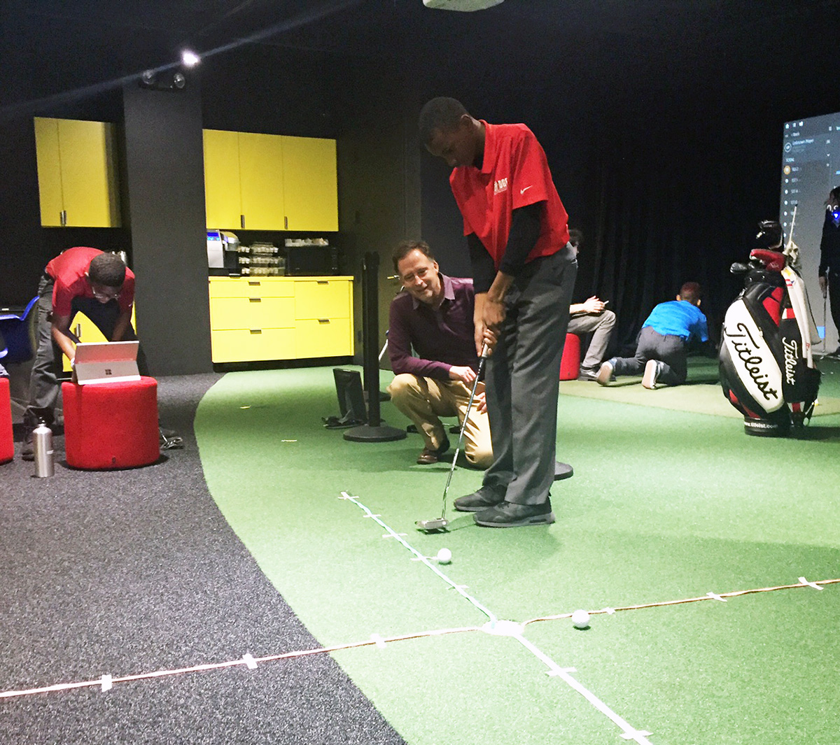
Our students made grids on the ground with measuring tape so they could precisely measure locations.
While not quite “big data,” there was no practical way to do the hundreds of needed computations by hand or with a calculator. But armed with laptops and Excel, the students were able to carry out these calculations in a flash using “averageifs” statements, which combine averaging with one or more “if” conditions.
The putting results from the various distances were then combined using a “weighted average,” which reflected the number of short, medium and long putts that happen in an 18-hole round. This allowed our young men to figure out how many putts per round they needed to cut to reach the level of a PGA Tour pro. It also allowed them to create a ranking for all of the players in our after school program.
And who came out on top of that ranking? Christopher Chatman was our No. 1 middle school putter, and Triniim Jones was No. 1 in our high school ranking.
How did we compare to the pros? Let’s just say we have some work to do on the greens.